I studied the first screen of 25 popular iOS apps to determine how much text they use. The results shows us the value of taking a principled approach to writing text for mobile apps – because product design is still all about the words.
Mobile apps dominate our digital experiences. People downloaded a record 204 billion of them from the Google and Apple app stores in 2019. A quick Google search and a calculator tells me that’s an average 25 mobile apps for every person on Earth.
“Beyond code, beyond visuals and interactions, what do all these apps have in common with each other? Text”
I’ve installed a lot more than that on my phone: 161 apps at last count. I use apps for everything from movies and music to weather and maps. Lots of social stuff, banking, travel, local services, fitness, cooking, more than a few games, even apps made by governments. And beyond code, beyond visuals and interactions, what do they all have in common with each other?
Text. Every app contains at least some text. Text makes up interface controls, labels for navigation, prompts for search, and more. Text introduces us to each app, starting with its name, and text guides us to how apps work and what value they provide, from instructions and inputs to settings and disclaimers. Overall, text does a lot of heavy lifting when it comes to helping us get value out of apps – you’d have a hard time using them if the text wasn’t there.
So if text is so fundamental to our experiences with apps, why are we relatively blind to its role in interface design? If it’s one of the most common elements in our designs, why is it so often the last thing most teams focus on – if they focus on it at all?
My hypothesis is that text is so common that we’ve forgotten everything it does for us.
Measuring the letters
I created a method for determining how much space an app uses to show text, using a grid of 200 cells and counting how many cells contain any letters, numbers, words, or other bits of language. I examined the first screen that loaded in 25 popular iOS apps across a variety of use cases (such as social media, retail, services, personal finance, and more).
Here’s what this process looked like for the Apple Music app:

About 36% of the first screen of Apple Music’s iOS app contains text. And yes, that is an NKOTB album.
But beyond how much text an app uses, I also wanted to know something more important: what’s the right amount of text to show?
Calculating the results
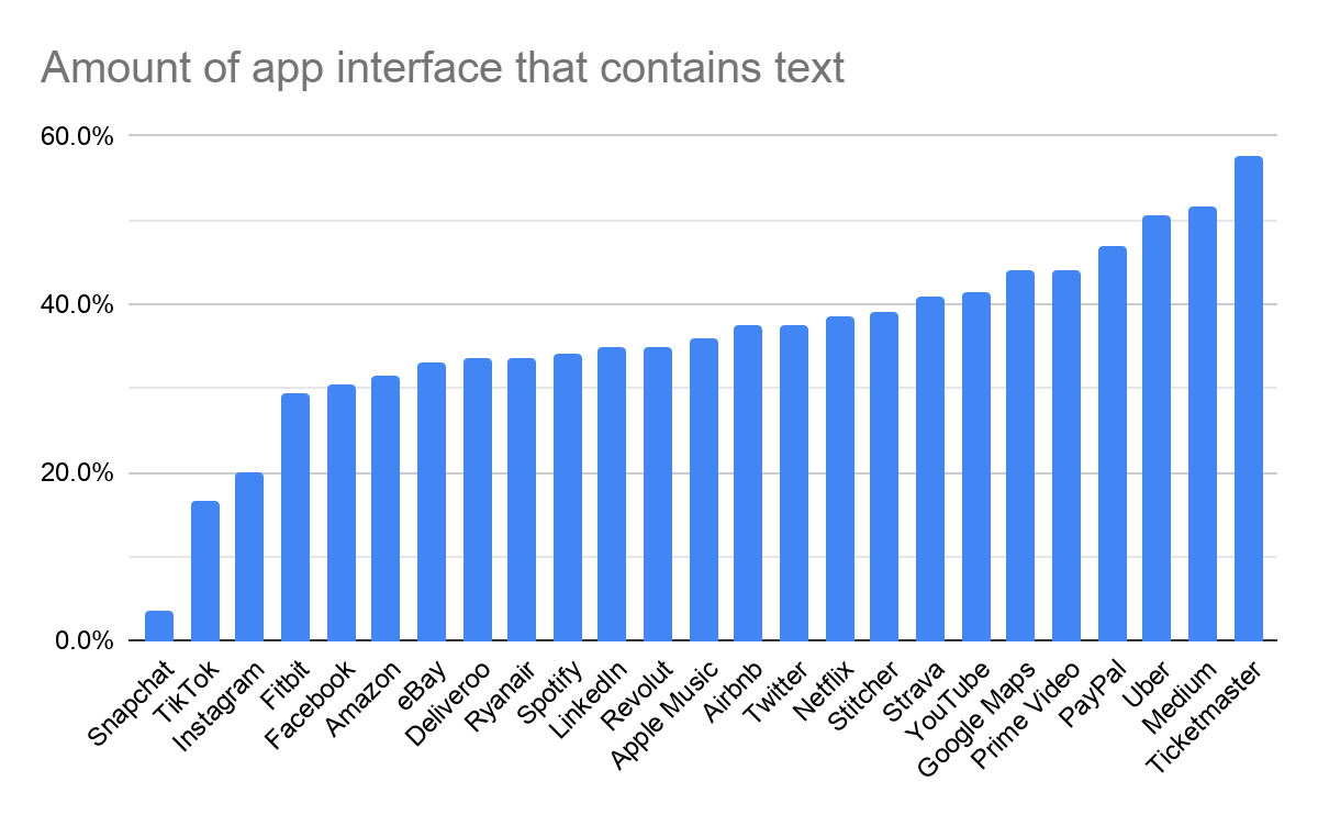
It turns out that 36% of the average iOS app’s starting screen is used to show text. That ranges from just 3.5% for Snapchat to 57.5% for Ticketmaster, with a lot of apps clustered between 30% and 40%. Outliers at the top end include Google Maps (44%), Paypal (47%), and Uber (50.5%.)
See the full study and results for all 25 apps.
Looking across all of these apps, the amount of screen space used to display text is remarkably similar. Throwing out any number of the highest and lowest values barely shifts the average. As you can see in this chart, over half of the apps I studied used between 30-40% of their screen area for text:

Text shown by app use case
Not all apps are created equal or serve the same purpose. So the amount of text they display varies greatly by their use case – the job they’re intended to do for the people who use them.
For example, personal finance apps like PayPal (47%) and Revolut (35%) use a lot of text in their starting screens to display information about accounts, recent transactions, and activity. Similarly, apps focused on retail, such as Amazon (31.5%) and eBay (33%), and services, such as Deliveroo (33.5%) and Uber (50.5%) often need to show more text in order to provide immediate value to their audiences. Apps that focus on maps, such as Google Maps (44%), Strava (41%), and Uber (50.5%) show the most text because of all of the metadata appearing as labels, which help people orient themselves.
“Social media apps reserve most of their interfaces to share personal video or images instead of text”
On the other hand, social media apps – especially Snapchat (3.5%), TikTok (16.5%), and Instagram (20%) – reserve most of their interfaces to share personal video or images instead of text. Even when that media includes text, it generally plays a secondary role in the experience, such as navigation or context. Activity tracking apps such as Fitbit (29.5%) and Strava (41%) tend to use more of their screens to show visualizations of activity data rather than representing that data in text or language.
Here are the average results for each set of apps by use case (some are shown multiple times because they serve more than one use case):
- Social media: (Facebook, Instagram, Snapchat, TikTok, Twitter, YouTube) 26.4%
- Fitness: (Fitbit, Strava) 35.3%
- Travel: (Airbnb, Ryanair) 35.5%
- Music & audio: (Apple Music, Spotify, Stitcher) 36.3%
- Streaming media: (Apple Music, Netflix, Prime Video, Spotify, Stitcher, YouTube) 38.8%
- Services: (Airbnb, Deliveroo, Uber) 40.5%
- Retail: (Amazon, eBay, Ticketmaster) 40.7%
- Personal finance: (PayPal, Revolut) 41.0%
- Maps & transport: (Strava, Google Maps, Uber) 45.2%
What’s the right amount of text to show?
I went into this study assuming that there isn’t a one-size-fits-all answer to the question of the right or best amount of text to use in an app screen – it’s always going to be contextual to the services an app provides (and to whom it provides them and how).
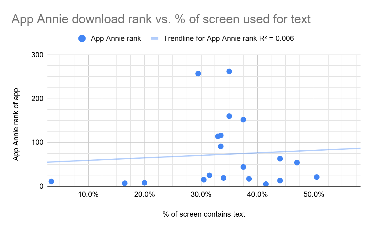
But to check that assumption, I plotted the amount of space used for text in the apps I studied against their App Annie download rankings to see if there’s any correlation with popularity and widespread use.

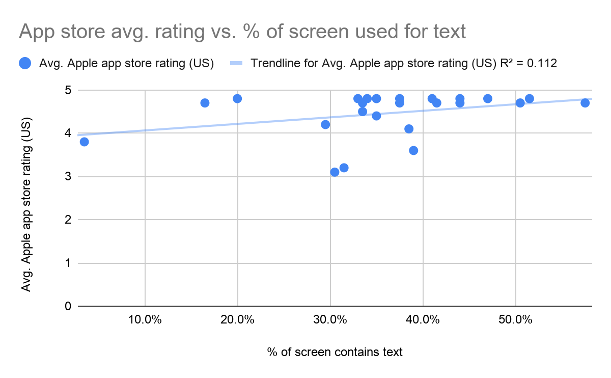
There’s no relationship here at all. Similarly, plotting the amount of text shown in an app versus its app store ratings also revealed a very weak relationship:

Even if there were strong relationships between these factors, we know that correlation isn’t causation. Overall, my biggest finding is that there’s a cluster of 11 very popular apps with high ratings that happen to use between 30-40% of their screen space to show text.
“My theory is that app developers shouldn’t use less than 30% or more than 40% of their first screen for text”
I’d need to study many more apps to prove this out, but my theory is that app developers shouldn’t use less than 30% or more than 40% of their first screen for text unless they’re narrowly focused on a specific use case, such as social images/video on the low end or news/finance on the high end.
Any company building a new app that uses something other than 30-40% of the screen space for text should weigh that decision carefully and validate it with research and testing. Otherwise, they’re flying in the face of a clear trend present in popular apps across the globe in many common use cases.
So how can you work from these results to make the best decisions about the text you show in your app?
The write stuff
You’ve probably noticed that Snapchat is the clear outlier out of all the apps I studied, using only 3.5% of its first screen to show text:

About 3.5% of the first screen of Snapchat’s iOS app contains text. Also, my dog is 100% adorable.
This minimal use of text bears more scrutiny, especially as the next closest app I studied was TikTok, which uses a relatively gargantuan 16.5% of its first screen to show text. This begs the question: how should an app developer make decisions about the amount of text to show and its quality?
At Intercom, we work from principles to make these decisions so that we can avoid known failures, repeat our successes, and stay aligned as we move fast with our products. For example, we have a content design principle of “Strive for less,” which means that when we have two competing options that are otherwise equally good, we’ll choose the one that uses less text.
“Snapchat opens with the camera view so users can create their snaps as quickly as possible. Seeing other people’s snaps is secondary to the act of creating your own”
Snapchat may follow a similar principle, but they don’t need to show much text because they’re not just building just a camera-first app, but also a creator-first app. Snapchat opens with the camera view so users can create their snaps as quickly as possible. Seeing other people’s snaps is secondary to the act of creating your own.
Meanwhile, on the far end of the scale, Ticketmaster had the highest amount of text, using 57.5% of their first screen. This isn’t just due to the retail focus on the app, but specifically to Ticketmaster’s use of poster-like images featuring large text to sell tickets for events. They use even more space to show text than Medium (51.5%), which is an app focused on reading!

About 57.5% of the first screen of Ticketmaster’s iOS app contains text. Mamma mia, indeed!
Another of Intercom’s content design principles comes from Simon Sinek: “Start with why.” This principle reminds us that the value we provide people (and our motivations for providing it) should come first before a detailed explanation of instructions.
We might see this principle at work in eBay’s app, where the first text used for messaging (instead of search or navigation) is a large, high-contrast banner reassuring people they can sell their items safely and get 100 free listings per month.
I imagine this addresses two concerns eBay have found in research: sellers hesitate to list items due to: 1) a lack of trust in buyers; and 2) the cost of creating a listing. These factors could make this banner the most valuable message for new users (and therefore for eBay) when they open the app.

About 33% of the first screen of eBay’s iOS app contains text, but they put the most important thing first.
Intercom’s final content design principle is inspired by Steve Krug: “Don’t make me think!” This means we try to remove as much ambiguity as we can, being clear, not clever. We use plain English in order to be concrete and specific. And we always emphasize the most important thing someone needs to see right away.
You can see a great example of this in Netflix’s app, where the primary focus is on a series named Derry Girls. This series title is the first message Netflix shows apart from navigation – and it’s shown in huge, all-caps text that uses 8% of the entire screen. For comparison, consider that all of Snapchat’s UI text only takes up just 3.5% of the screen. I imagine Netflix intends for these giant-sized words to grab my attention, and rightly so: I love the show and when I took this screen capture, a new season had recently became available.

About 38.5% of the first screen of Netflix’s iOS app contains text. Derry Girls is how I’m learning Irish slang.
App design is still about the words
So 36% of an app’s first screen is (checks calculator)… just over one-third of the total space.
That’s a significant amount, especially given that mobile apps are very small spaces. Anything taking up a third of the screen has to be valuable enough to pull its weight. If the text we see in our apps weren’t communicating something valuable, then it wouldn’t be there.
But text is more than just a means of communicating messages – it also serves as the interface itself. If you remove the interface text from mobile apps, they turn out to be empty, confusing experiences. Mig Reyes did this experiment with desktop websites 6 years ago and the lesson he shared then still holds true for mobile apps today: “Design is still about the words.”

Here’s the Revolut app shown with and without interface text. Could you have a meaningful, valuable experience with an app like this?
Without text in the UI, most apps become far less valuable… or completely unusable! The sole exception seems to be camera-first apps like Snapchat and TikTok, which only have a small amount of interface text in their first screens. But “camera-first” doesn’t mean “camera-only” – both of these apps also have deeper screens (such as profiles, friend lists, settings, and more) that are very text-heavy. Even when there’s not much text at the surface, it still dominates the system as a whole.
“Making the language useful, usable, and functional takes effort. It’s not something to leave until the end”
So while most app design teams focus a lot of their time on things like Gestalt principles, iconography, color palettes, typography, and “delight,” they should keep in mind that language is design material, too. It’s the infrastructure guiding people in your app – and not just in informative moments like onboarding or error states, but throughout the entire user journey. Making the language useful, usable, and functional takes effort. It’s not something to leave until the end – or even after the end, which is still an all-too-common problem.
To build meaningful experiences, product teams should focus on the words just as much, if not more, as any other part of their apps. After all, language isn’t a distraction from the experience.
It is the experience.

