
The design community no longer has to prove the value of design to get a seat at the table. Designers have demonstrated that design can be a central pillar of business success. But they’ve also lost something along the way.
Designers have stepped off their island where slick, yet ineffective and impractical design is made. They’ve embraced cross-functional relationships and work closely with partners all across the organization. More than ever, they understand who their customers are and what they care about. They design systems, not destinations. And instead of primarily thinking about interfaces, they think about the product strategy. They design for business outcomes.
But when you’re deep in all of these additional layers of building products, it’s easy to forget about the importance of also nailing the thing designers are experts at: interaction design, the optimization of the interactions between user and product.
When we recognized this issue in our own design team, we established the fundamentals of good interaction design. They are a reminder about the things that are deeply important to us, but sometimes forgotten.
It’s by no means an exhaustive list and since they incorporate our product design principles, they are not universal to every company. They are fundamentals that we at Intercom care about. But hopefully they can serve as a reminder for you as well and maybe even get you thinking about the fundamentals of interaction design that are important to your company.
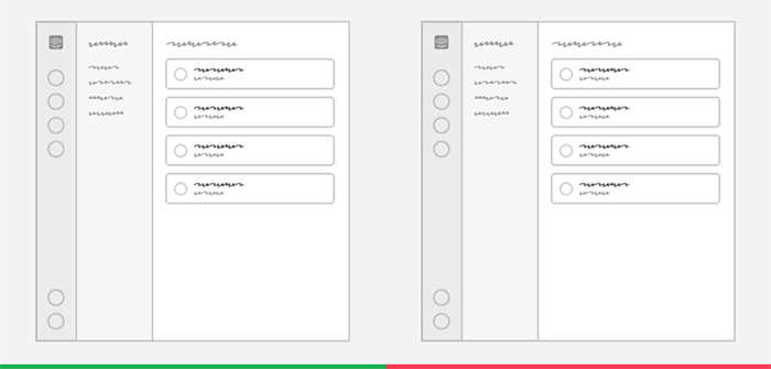
1. Present the same object in a familiar way everywhere
Intercom, with its vast breadth and depth, can feel overwhelming. We can make it easier for our customers by making the core objects in the system (e.g. conversations, users, messages, etc.) easily recognizable and ensuring they behave the same way everywhere. Recognizing is easier than recalling.

✅ Do
Default to showing an object the same way everywhere. When you do have a strong rationale to deviate, make it feel familiar and consider whether the object needs to be displayed differently elsewhere in the product.
❌ Don’t
Make local optimizations that are not reflected elsewhere, or are inconsistent with other contexts. Don’t create multiple similar, yet slightly different, variations of the same object.
Ask:
- How is this object shown elsewhere in the product?
- Can we reuse the same component here?
- If not, how can we make it feel familiar?
- Do we need to update it elsewhere in the product?
2. Establish hierarchy in your interface
By establishing a clear visual hierarchy we can help our customers understand how the product works, the relationships between different parts, what’s important, and what isn’t.

✅ Do
Use space, typography, grouping, and indentation to clearly communicate the hierarchy and relationships between different parts of the interface.
❌ Don’t
Blur the lines between different hierarchy levels by not having distinguishable groups. Don’t create too many boxes within boxes.
Ask:
- Is content laid out in clear, distinguishable groups?
- Is there enough space between these groups?
- Is related information grouped together?
- Are the correct text styles used to establish information hierarchy?
3. Create visual rhythm and balance
Make your interface easily scannable to help customers understand it quickly. Making it aesthetically pleasing can increase their perception of how usable it is.

✅ Do
Anchor the most important part of your interface and use varying styles and layouts to balance your design and make it easier to scan. Use a grid system and pay close attention to alignment.
❌ Don’t
Lay everything out in a flat list. Don’t use overly long sentences or lines.
Ask:
- Is it easy to scan the design and know what the most important part of it is?
- Does it feel visually balanced?
- Is the interface aligned to a grid system?
4. Use commonly accepted patterns and interactions
We can help our customers become more familiar with Intercom and use it more efficiently by limiting the amount of interaction patterns that they need to learn.

✅ Do
Use existing patterns from our design system. Favor common interaction design patterns over clever bespoke optimizations. Follow industry-standard interaction design principles.
❌ Don’t
Introduce similar, yet different variations of our existing design system patterns. Don’t create custom patterns when there’s an established industry standard. Don’t misuse an existing pattern.
Ask:
- Can an existing design system pattern be used here?
- If not, what does the industry-standard pattern for this look like?
- If you think you need a new pattern, have you talked to the design systems team and other designers? Can this pattern be fed back into the design system for other designers to use?
- Is it clear how the pattern can be interacted with?
- Is there clear feedback when users interact with it?
5. Use progressive disclosure
By using progressive disclosure we can make Intercom simple for the majority of our customers while enabling more flexibility for our advanced customers.

✅ Do
Start with simple defaults and gradually reveal flexibility. Optimize for the most common use case.
❌ Don’t
Overwhelm customers by showing full flexibility right away. Don’t compromise the most common use case for edge cases.
Ask:
- What is the most common use case?
- What should the default settings be so most people don’t have to change them?
- How can we reveal information progressively?
- Are we compromising the most common use case for an edge case?
6. Be clear and concise
Language is the key to helping our customers understand how Intercom works. However, too much content can have the opposite effect, with customers scanning the page without reading it and therefore not achieving what they need to do.
![]()
✅ Do
Be clear and concise. When necessary, progressively reveal information by using tooltips and links to help docs for learning more. Use illustrations to explain ideas. Edit ruthlessly.
❌ Don’t
Use long, detailed content to explain how something works. Instead, consider what’s making it complicated and fix the underlying problem. Avoid falling into the trap of being technically correct, but difficult to understand.
Ask:
- Is it easy to scan and understand what it is without having to read all of the content from beginning to end?
- What if you had to cut half of the content? Can you do it without losing meaning?
- Is the value proposition clear?
- Is it clear what the user needs to do?
- Will this be clear to someone with no previous knowledge of the content?
- What can we illustrate visually instead of explaining with content?
7. Consider responsiveness and speed
Performance is a feature that needs to be carefully considered. When ignored or mismanaged it creates uncertainty and a janky user experience.
✅ Do
Give users instant feedback when they interact with the product and set expectations on wait times.
❌ Don’t
Forget about the loading states.
Ask
- What happens right after interacting with the interface?
- Is it clear that the action was received and is currently processing?
- Is it clear when the processing will be complete?
8. Guide users to what they should do next
We usually start by designing for the happy path, but that’s not how most customers will first experience it. Without clear guidance they might not reach the happy path at all. That’s where great interaction design comes in.

✅ Do
Make it clear what users should do next and make it easy to achieve. Specifically consider empty states, error messages, and end-states.
❌ Don’t
Don’t create dead ends where users have to figure out what to do next by themselves.
Ask
- What happens if you have no data to show?
- What happens when there’s an error?
- Is it clear what the user should do next?
9. Be mindful of accessibility
Although we haven’t yet established standards for accessibility there are lots of things you can do to make your design more accessible.

✅ Do
Use existing design system components since they are made to be accessible. Use text styles and sizes that are easily legible. Add enough color contrast. Don’t use color alone to convey meaning.
❌ Don’t
Introduce new colors or text styles without talking to the design systems team. Avoid introducing custom components because they might not be accessible.
Ask:
- Is there an existing design system component, color, or text style that you can use?
- Is the text legible enough?
- Is there enough contrast?
- Is there more than just color used to convey meaning?
Focus on our core craft
While the product design discipline has matured a lot over the years, it’s important that we don’t forget or de-prioritize our core craft. Increased focus on customer and business needs shouldn’t be an excuse for bad interaction design. Design fundamentals like these help set a baseline for interaction design quality, help avoid egregious errors, and ultimately act as a foundation on which to build excellent customer-focused software.
This was originally written as an internal document for our design team. If you’re interested in more content like this, check out our product design page for more content and our open roles.