
If you have an application or SaaS product, the welcome page that users see after signing up is much more than a cheerful “hello” to your users. Or, at least, it should be.
The welcome page comes at a really critical time for your app. It’s during the onboarding period when new users will decide if you can follow through on the promises you made of saved time or increased revenue. If the experience meets their expectations, they’ll continue to give your app a try; if not, they’ll go somewhere else.
Whether you use a welcome page as the first step in your onboarding experience or to simply highlight your app’s best features, there are a few basic guidelines you can apply for using this page to capture a user’s attention – and keep it long-term.
What is a welcome page?
A welcome page is usually one or more web pages or modal overlays that appear the first time you open an app. The best welcome pages direct a user’s focus to the welcome message, while also orienting them to the product.
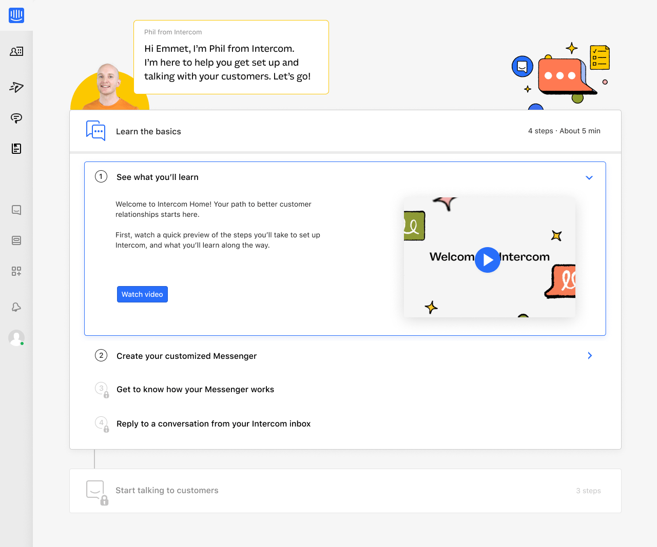
It may look something like this welcome screen that we’re testing at the moment for Intercom:
Or this simple empty state from Dropbox Paper:

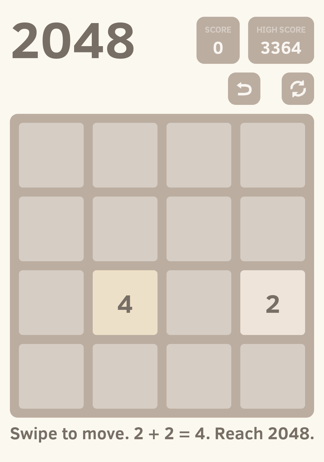
Or even something like the first screen of the popular 2048 puzzle game, which welcomes users with a single line of text at the bottom:
Welcome pages take different forms depending on the app or product. A welcome page for a SaaS product designed to manage your entire company’s projects and tasks will look very different than one for a simple puzzle game. That’s because users of the SaaS app will typically need lots of guidance to get started, while users of the mobile game can grasp the concept in just a few seconds with a screen or two of instructions.
While there are plenty of welcome page designs, the most successful ones show users how the app will deliver on its promises.
Why welcome pages are important
Your users downloaded or subscribed to your app because you sold them something they find valuable. The welcome page is your first opportunity to show them how your product will meet their needs. It also does these three important jobs:
1. Welcome pages reflect your brand
Users probably have some knowledge of your brand before making it to the welcome screen: they’ve seen ads, visited your website or followed you on social media. But the welcome page is the first time they are experiencing your product, and everything you include on it is a reflection of who you are and what you offer.
“The content on your product welcome page should be consistent with what users experience elsewhere”
The content on your product welcome page should be consistent with what users experience elsewhere. If your marketing website is a single page with a download button, users will expect your welcome page to be just as uncomplicated in design and copy.
2. Welcome pages lay the foundation for customer success
The way customers engage with your product out of the gate is hugely impactful on whether users churn or not. A blank page in a brand new app is highly intimidating, even for the most experienced users. By offering reassurance and guidance via the welcome page – and following up with onboarding messages or a product tour – you’re helping users feel more confident about taking the first step.
If your welcome page is the start of your onboarding flow, that page should help them understand what’s going to happen next and how onboarding will make them more successful.
For experienced users or those coming from competitors, your welcome screen might need to serve a different purpose. For example, instead of sharing learning resources, you might want to jump straight to relevant advanced actions, such as importing their data into your app. This gives them a straight path toward success, which they may already have a vision of (unlike inexperienced users).
3. Welcome pages reassure users about their product decision
Even the most eager new users are coming to your product with a sense of uncertainty and a host of existing habits. Will your product deliver what they need? Will it fit within their existing workflows and processes?
Use in-app messages on your welcome page to greet new users and let them know where they can find learning resources or contact support. By doing so, you’ll take the first steps toward easing their anxiety. Compared to all other forms of messaging, in-app messages are more likely to be read, clicked on and responded to.

4 welcome page tips to engage your new users
There are some key UX design elements that can help welcome pages be more effective at catching users’ attention.
1. Use the signup data you’ve collected to welcome users personally
When a user sees your welcome page, it should be personalized for them. At minimum, this means including their name, but ideally, this page should be tailored to their role, how they’re going to use your product, or what kind of plan they’ve chosen.
This personal welcome isn’t just a “nice-to-have” – it prevents critical errors that contribute to churn. If you welcome a paying user to your app with a message urging them to upgrade or welcome a sales rep with a message about “teaching them all they need to know about sales,” you look uninformed. Customizing this page based on the data you’ve collected at signup shows you know who they are, what they need and are fully prepared to deliver.
As Matt Sornson, head of Growth and Marketing at Clearbit, puts it, “The better your customer onboarding process, the more it feels like your product was designed specifically for one customer. Using data in your onboarding means being able to provide a personalized, concierge-like experience to all of your new customers, at scale.”
2. Make the welcome page experience interactive
Take another look at the welcome page we showed you earlier from the Intercom onboarding experience we are testing:
This welcome screen is the very first thing a new Intercom user sees after signing up. It was inspired by video game tutorials, which start simple but incrementally expose players to the fundamental mechanics needed for success.
In the same way that video game tutorials require gamers to interact with on-screen prompts, welcome pages like these ask new users to interact with the app itself. After watching a short video, our newest customers take quick, easy steps, such as creating their customized Messenger experience or replying to conversations in their inbox – tasks that not only show them how Intercom works but incrementally build upon the skills they’ve learned in each previous step.
Nudging new users to use your app right away helps them learn faster than, for example, reading dialogue off a screen. It also slowly but surely builds a user’s confidence, so they understand not only how to do something that first time but feel informed enough to go back and try it again on their own.
3. Offer sample content for a quick start
Some apps, like document creators, form builders and design tools, look highly intimidating to new users for one specific reason: they start with a blank screen. This empty screen creates paralyzing feelings of “what do I do now?” or “where do I start?” even if users have an end goal in mind. As an example, look at this new draft screen from Medium, which is pretty daunting even for experienced writers:

If your product relies heavily on customer creativity, including sample content in your empty state drastically reduces user paralysis. It helps them visualize what their own creations will look like in its place and quickly understand how to add in their own information in the right spots. Sample data also illustrates your app’s value by showing what it’s capable of, whether a complex form or a gorgeous one-page website.
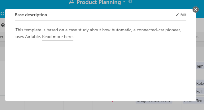
Table builder Airtable does this by creating and pre-filling a selection of sample tables, or “Bases,” for common purposes, including sales and product management:
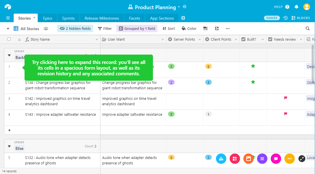
This product engagement goes one step further, too: each sample table’s data is based on a real company’s usage of Airtable, which new users are prompted to read about right from the welcome screen. The Product Planning table, for example, is based on an agile product management table from Automatic Labs.
4. Provide easy access to support
What happens if a user immediately has a question they need answered? Do they have to leave your welcome page to get support? They shouldn’t have to – not only is leaving this page inconvenient, it’s highly possible the user will get distracted and forget to come back.
Intercom allows your in-app welcome messages to work with support chatbots, so users can quickly get answers and get on their way, without overwhelming your support team with basic questions.
Take a fresh look at your welcome page
If your app doesn’t seem to be engaging new users the way you thought it would, take a look at what they see when they first enter. Is there a welcome page that greets them, offers guidance, and steers them in the direction of the value they were promised? Or are they left to their own devices?
If you don’t yet have a welcome page, use these tips to make one. You’ll see higher engagement from your new users – and they’ll see how you’re dedicated to their success from the very first moment they use your product.