At Intercom, one of our product development principles is think big, start small, learn fast.
One of the ways we learn fast is by carrying out evaluative research to build confidence in the product design direction we’re pursuing. We often aim to get product concepts in front of users very early in the product development process, long before any code has been written.
This approach to user testing poses an important and ongoing question – what’s the right level of design fidelity to present to your research participants? How close to the final design do those concepts need to be in order to elicit accurate insights from those who are testing them? How do you find the right balance between “crude but early” on the one hand and “polished but late” on the other? What level of design abstraction hits the sweet spot?
“We’ve found it’s helpful to avoid using the term ‘design’ when talking internally about what to show participants – we prefer to use ‘research stimulus’”
Words matter
First of all, although we talk about design fidelity, we’ve found it’s helpful to avoid using the term “design” when talking internally about what to show participants during user testing – we prefer to use “research stimulus”. Terms like “research stimulus” or “provocation artefact”, while sounding a bit wonky, help communicate that the thing you’re going to show a participant is a tool to elicit insights on an overall concept, rather than specific design features.
Identify the problem
It can be tempting to use the latest, most polished design files available when creating the research stimulus, but this comes with certain costs that have to be considered. Participants will pay attention to the highest level of fidelity that you provide – if you’re interested in whether a concept has value, hearing participants’ comments about microcopy on a CTA is likely to add noise to the feedback you’re looking for.
Instead, we’ve found it’s helpful to start with the problem – what we’re trying to learn about – and match that to the fidelity of what we show research participants during user testing.
So to determine the correct design fidelity, you need to identify which of the following problems you are trying to solve:
- Testing concepts: Does this idea have value?
- Testing system design: Can users form a ‘good enough’ understanding of this system?
- Testing usability: Can people use this product?
Once you have settled on the problem you are trying to solve, that will help determine what level of design fidelity is required of your research stimulus.
Getting clear on the problem upfront also helps to create alignment with your cross-functional partners in design, product, and engineering – all the more important because creating a research stimulus is a collaborative effort, and one where ownership can be unclear.
“In the early stages, you’re not interested in how they’d interact with it. You’re interested in whether it would be valuable to them”
Testing concepts: Does this idea have value?
At this stage, your problem is figuring out ”Does this idea have value?” Specifically, do customers think this idea will help them solve the problems they’re struggling with? In the early stages, you’re not interested in how they’d interact with it. You’re interested in whether it would be valuable to them.
During the test itself, you’ll want to confirm that the participant actually experiences the problem you’re trying to solve, show them the concept, and evaluate whether they expect it to solve their problem in a valuable way.
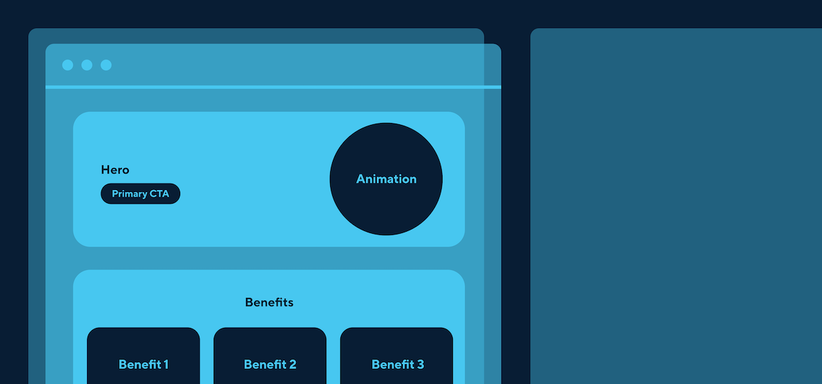
Your test stimulus doesn’t need to look like an interface at this point. In fact, it’s probably better if it doesn’t – if you do choose to present concepts as an interface, be aware that your participants may jump ahead to thinking about how they’d interact with it, how it would relate to the rest of your product, and what they think about the visual design. This kind of feedback is easier to give, so participants will naturally gravitate towards it instead of thinking deeply about the concept itself and how it might address the problem they’re experiencing. Your research stimulus just needs to communicate the idea you’re testing, and little else.
Quick text descriptions, storyboards, landing page mockups, diagrams in Google Slides, or whiteboard-style doodles are all legitimate options. Keep it simple and focused by blurring unnecessary copy and using obvious placeholder graphics.
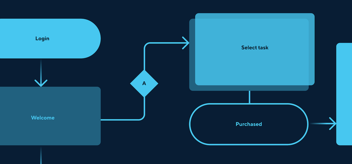
Testing system design: Can users form a ‘good enough’ understanding of this system?
Sometimes, a product team may be working on building out a whole system, rather than interfaces or flows. When doing research at this stage, your question is probably whether, based on what the team has conceived so far, your users can form functional mental models that will enable them to use the product without getting blocked or confused. The best evidence for this is whether users can make accurate predictions about how they’d do representative tasks within your system.
While you could simply show abstract diagrams of the system and ask users how they’d expect to interact with it, this doesn’t have much ecological validity; actually showing stimuli that look more like a user interface makes the research feel more realistic. Again though, we’ve found that asking a participant to actually use a prototype makes it almost impossible not to have their attention deflected to interaction design, and you’re probably still not solving for that.
Consider giving them realistic problems and asking them to talk you through how they’d expect to tackle them using your mocked-up interfaces, while you share your screen and look after the specific interactions that move them through the product. This will save you either building out fully interactive prototypes before you have confidence in the design direction, or risking frustrating participants with interactions you know are still janky.
Testing usability: Can people use this product?
At this stage you’ll want to know whether a user can interact with your product with a realistic level of support (e.g., no more onboarding than you’re likely to provide in the final product) and carry out tasks that represent the problem you’re solving.
There are many kinds of usability testing, and in all of them, interaction design becomes more important. You can test usability with prototypes of varying levels of fidelity, once you’re clear and specific about the tasks you want your participants to carry out and test, and the interactions that are needed to enable them are supported in the prototype.
In summary
The lines between these phases are blurry, and it can be tricky to land on the right protocol for your situation. Prepare to tweak both the research stimulus and the questions you ask from session to session.
Finally, there’s no harm in asking your participants how they found the research session itself, rather than the research stimuli. Confusion or frustration are a sign that you have some more work to do. And if you get stuck, remember to start with the problem: what exactly are you trying to get from user testing session?
Want to learn more about working with our team? Read about our values, the way we work, and our open roles here.