Your brand is how your company presents itself to the world, but inevitably there will need to be slight adjustments along the way.
A brand is not a singular design element, font, color, illustration style, or icon. (Your brand ≠ your logo, for example.) Rather, it’s a system of interconnected elements that represent how your company looks, feels, and acts, and which combine to create a consistent, recognizable, unified personality.
So as your business grows, it’s natural that your brand will need to grow with it.
We’ve talked before about what goes into building a brand, but how do you go about evolving a brand as you scale? What do you need to consider as you start to add new team members and extend your reach to new audiences? And how do you keep your brand’s personality and appeal to upmarket enterprise customers without turning into a corporate clone?
Here’s what we’ve learned from our recent brand refresh project, and some of the tweaks we’ve made to help take us to the next level.
Stress testing the theoretical
Back in 2018, we launched a holistic rebrand with the help of an external agency. At the time, Intercom was very much an eclectic brand, so this work was foundational in helping to solidify our brand system with thoughtful creative decisions and specific guidelines that would help us to maintain a consistent and ownable brand.
But, as with any external rebrand, this new brand system was all very theoretical until the handoff to our internal team. Only then could we start to truly test it in real-world scenarios.
“Over the last few years we’ve really seen where the brand was strong, as well as where it needed tweaking”
Over the last few years we’ve been doing just that, and we’ve really seen where the brand was strong, as well as where it needed tweaking. Some things worked really well, but other rules just weren’t applying and needed constant adaptation, leading to confusion (and extra work) for our designers.
We also found that certain design elements just weren’t scalable. For example, that brand system relied heavily on a specific style of illustration and animation – but no one on our team illustrated or animated like that. This was a big restriction, particularly as we wanted to move our design fully in-house. Not to mention that building your brand around one single, specific, difficult-to-replicate element means that your whole brand is in danger if the designer responsible leaves or wants to try something different.
In this time, we’ve also grown, both in terms of our goals and our team size. We’ve evolved as a company, and we wanted our brand to mature with us and be clearer for new designers joining us.
Refreshing the brand
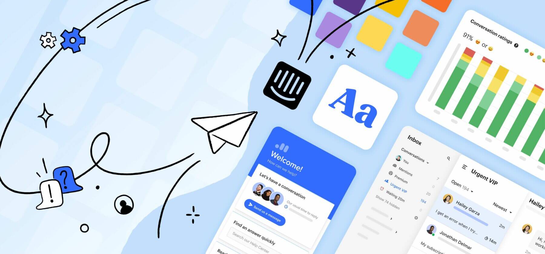
So with all this in mind, we kicked off a brand audit to see what was working and what needed work. We focused on five main pillars of our brand system: illustration, color, typography, product, and voice and tone.
Illustration
Then: The style and animation proved difficult to replicate on a go-to-market timeline. The existing illustration style was beautiful, but it was difficult to replicate without an in-house full-time illustrator. Likewise, the detailed animation was extremely laborious and time-consuming. Our usage guidelines lacked direction, which created a loose and unrefined feeling across placements.
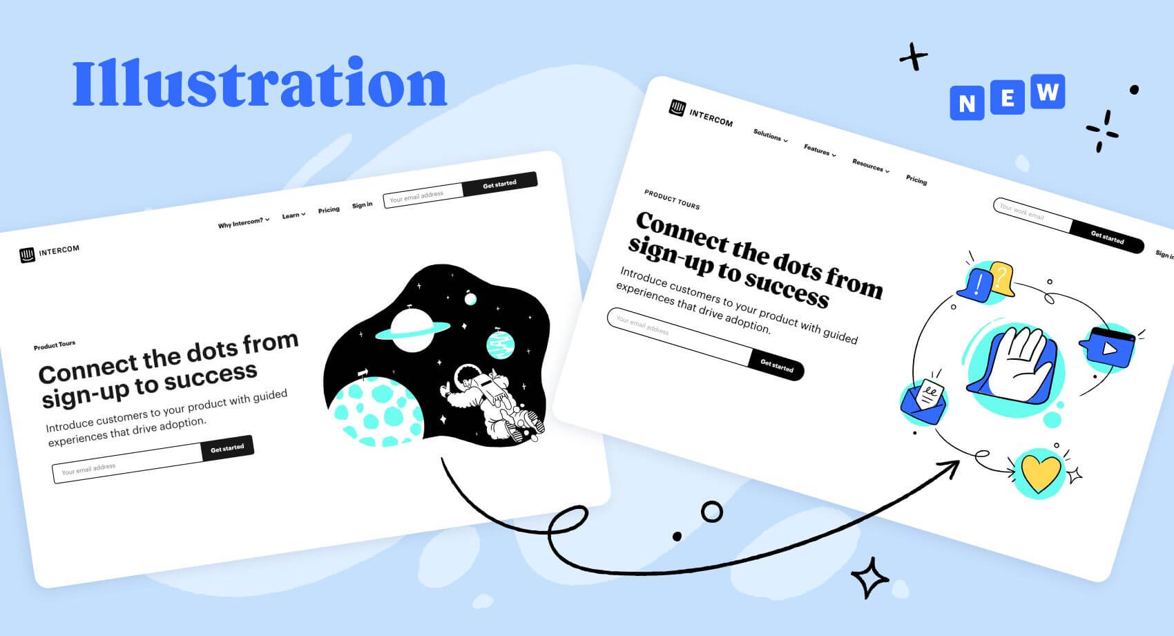
Now: The use of thinner lines, more strategic usage guidelines, and the elimination of full body illustrated characters make our system more scalable, and allow it to play a supporting role in boosting photography or product images, instead of stealing the show.
Color
Then: The stark palette made it difficult to pair colors, which meant we consistently repeated the same pairings. Our core colors of mint and black were constraining and didn’t work very well outside of digital applications. When bringing in our secondary color palette, it often veered into appearing too playful or even childish, which limited us in being strategic with tone.
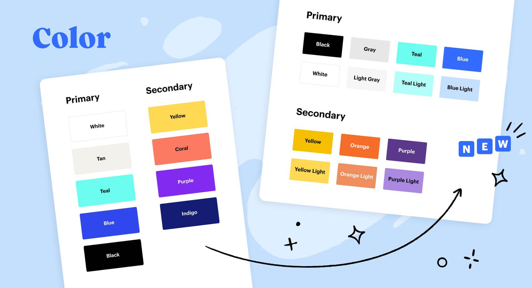
Now: We’re keeping our core color palette, but we’ve made some updates to the details and usage guidelines. We’ve carefully iterated on it to create a more unified, cohesive whole, ensuring that the colors easily work together while still packing a punch.
Typography
Then: Our font was a good palate cleanser, but it was limited in tone. In text-heavy applications, it lacked personality or hierarchy. As our sole typeface, it was perfectly agreeable. So agreeable, in fact, that it can feel like every tech company is using some variation of it – making it hard to stand out.
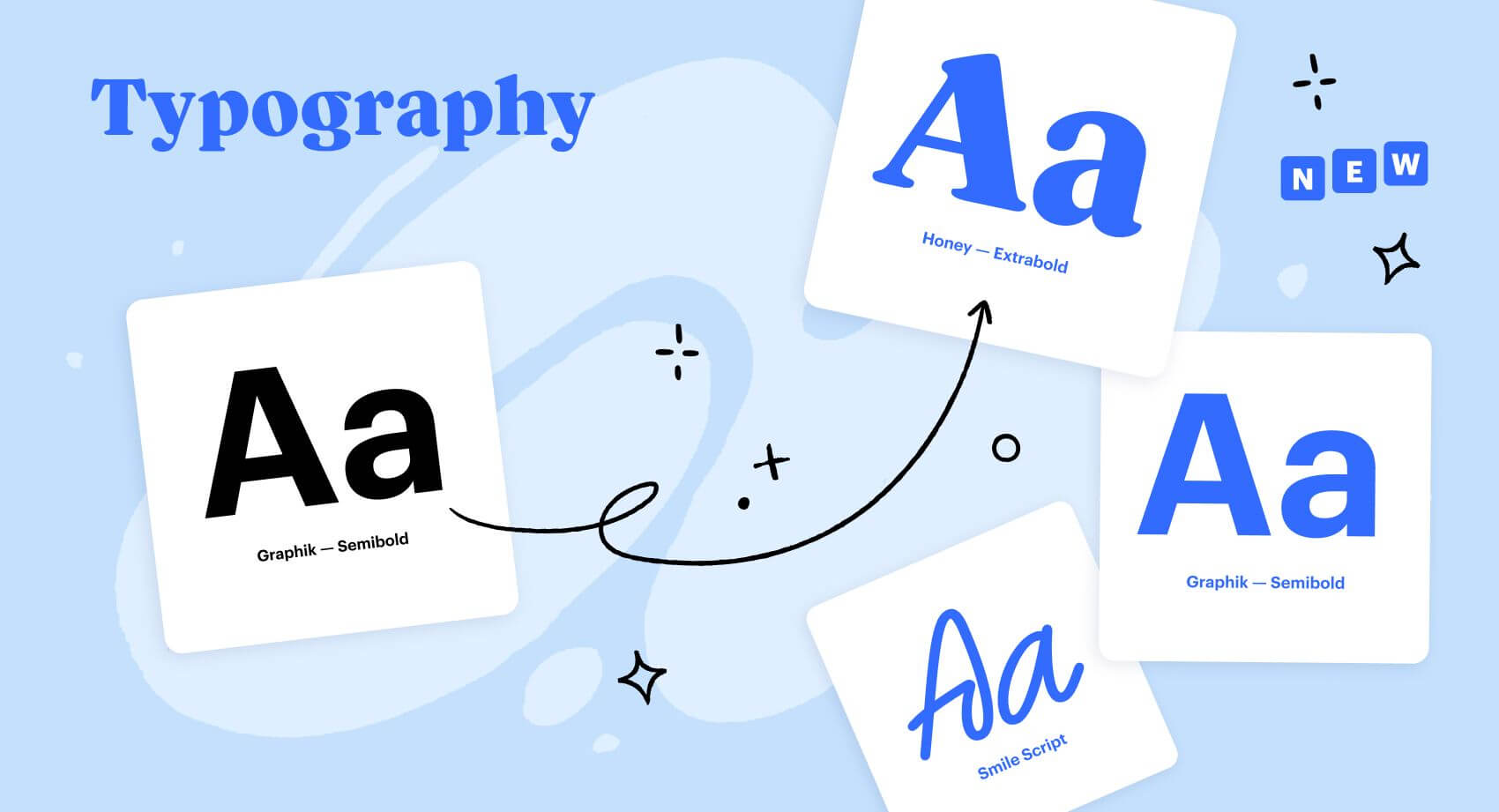
Now: We made the bold decision to create a totally custom headline font to complement our existing sans serif font. We have an incredibly talented typography designer on our team in Kyle Benson, our brand refresh project lead, so this was a great opportunity to leverage some of the unique talent at our disposal in an easily scalable, replicable way. The resulting headline font, which we’ve called Honey, adds some personality – we like to think of it as warm but opinionated. Honey is complemented by two additional custom fonts called Smile and Intercom Brand, which add a dash of additional personality when needed.
Product
Then: Reducing product visuals to focus on one feature at a time was creating more problems than it solved. Simplifying and abstracting the product in our marketing resulted in a lack of comprehension and general confusion about what our product did and how it worked.
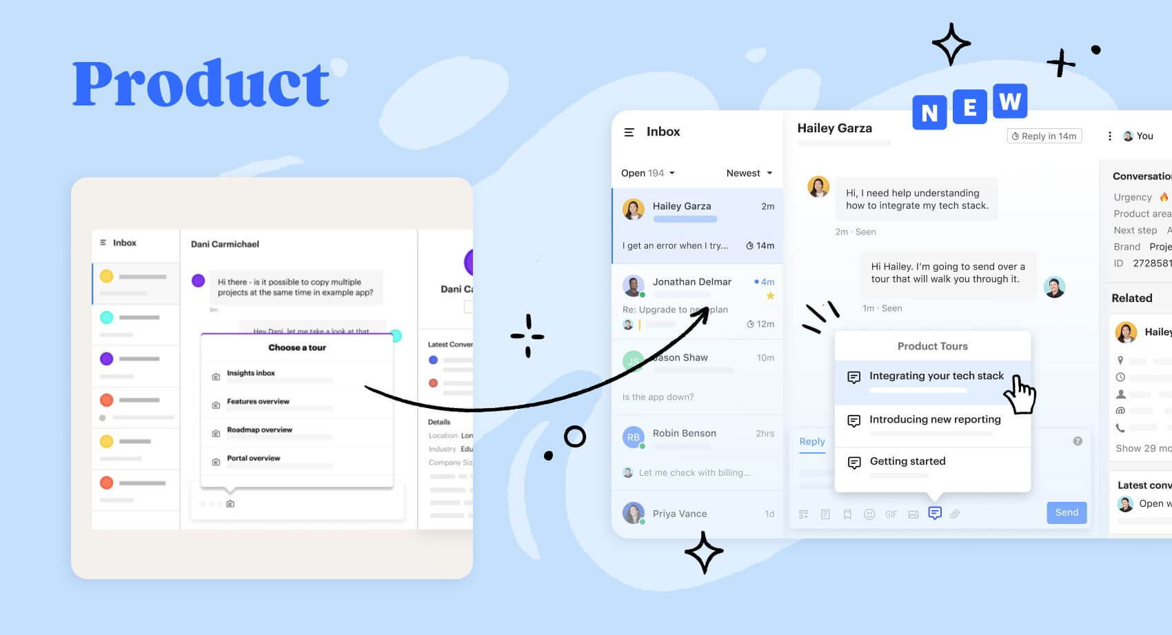
Now: With our product visuals, we’re now abstracting far less and really letting the beautiful product do the heavy lifting. We’re maintaining product integrity, layout, colors, and structure, but using animation to tell the dynamic story of how it works. In other words, we’re showing, not telling.
Voice and tone
Then: Our voice has always been playful, but we needed a way to scale this as we grow. This meant that we needed clear guidelines on how to approach new and different audiences – without ever losing our personality or becoming “corporate.”
Now: We’ve outlined some core characteristics defining what our voice is (conversational, clear, confident, delightful) and is not (goofy, oversimplified, flashy, flowery). We want our voice to complement our visual design. Together, they tell a consistent story that represents who we are as a company and what we value. Even when we’re talking to businesses, we always want to speak to real people – conversationally.
The magic is the people
Refreshing a brand isn’t just a simple scientific equation. It’s not as mathematical as existing brand system + real life usage + time + company growth = updated brand. There’s also a little magic involved.
The magic comes from getting a world-class group of creatives together to do what they do best: create. The Intercom Brand Studio is made up of designers, writers, typographers, photographers, illustrators, animators, and producers (oh, and we’re hiring). It’s the perfect storm of talent and opportunity – the kind of environment where ideas can flourish, and where the team’s individual talents can be leveraged in all kinds of cool and creative ways. Without the dedication, hard work, and raw talent of these creative folks, the Intercom brand refresh would never have been possible.
Thank you, Intercom Brand Studio, for helping to make this year-long passion project a reality.
Special thank you to:
- Kyle Benson (project lead, art direction, typography, color)
- Kristin Raymaker (motion art direction, product in marketing)
- Kira Bundlie (creative copywriting, tone and voice)
- Justin Rands (web, component system)
- Masha Popelyukhina (creative production)
- Josh Miranda (illustration, color)
- Jared Gay (animation/motion)
Want to make some magic together? The Intercom Brand Studio is hiring! Check out the open roles here.