
You might have noticed Inside Intercom is looking a little different today. What you’re experiencing is the result of almost a year’s work, designed not just to showcase the breadth of content we publish, but to make it easy for you to discover and consume it.
Over the past few years Intercom’s customer base has grown considerably beyond the startup and product-focused readership we initially focused on with Inside Intercom. We still love that audience, but we now offer products for sales, marketing and support teams and have been going deep on those topics as well. Simultaneously, Intercom has introduced features for larger companies: our customer base now runs the full gamut from early stage startups to large established companies.
While other parts of our website had evolved to reflect those new realities the blog remained a relatively basic WordPress setup. It displayed posts in reverse chronological order, had limited search functionality and was optimized for publishing long form content.
Time to kill the blog
The most successful blogs are usually very personal and tied to a particular worldview or area of expertise. That metaphor started to break as Inside Intercom covered more and more topics in a variety of mediums such as text, illustration, audio and video. We felt a publication was a much more useful metaphor. Think a good old fashioned newspaper – with familiar sections that readers immediately head for, but which allows them to easily discover the best writing and most useful information in other areas too. That’s why the initial code name for this project was “Kill the blog”. Here’s how we went about doing that.
When we started thinking about what the future of Inside Intercom would look and feel like, we distilled the tone of the blog down to four words:
- opinionated (confident, witty, but not angry)
- straightforward (no fluff, meaningful content)
- personal (exposing the people behind Intercom)
- playful (although never as a crutch)
When considering the design problems this rendition of the blog would solve, those qualities served as tent-poles for decisions. For example, our use of color in this redesign – one for each category – allows our personality to shine through in a way that our old blog didn’t.
 Explorations of the color palette
 Our final color palette
Listening to you, our readers
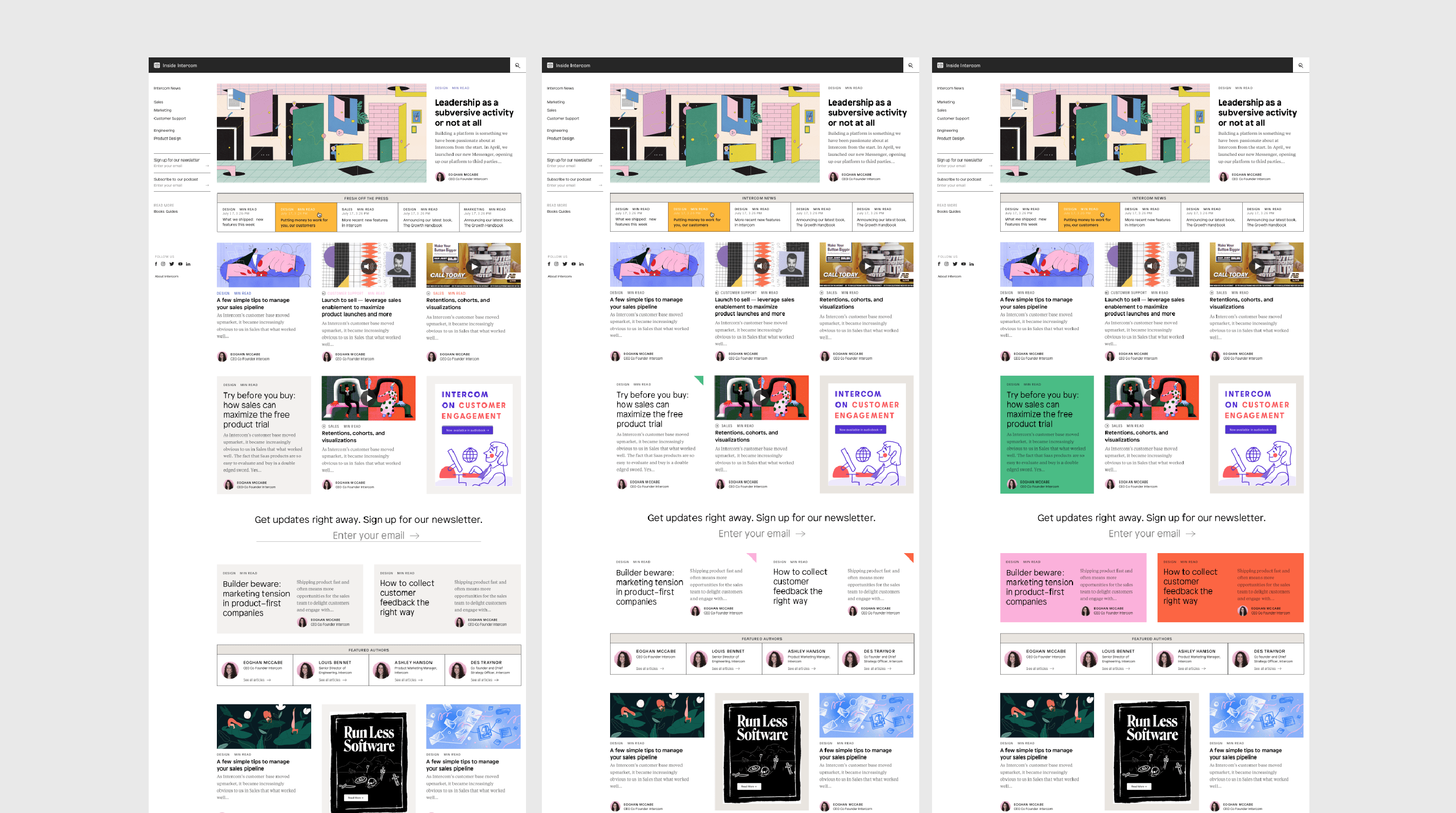
A cross-functional team – comprising members of our internal Brand Design and Content teams along with our digital agency and WordPress expert, 10up – set about researching and analyzing how people were using our existing blog and what they might want from a new one. We found you wanted to discover the content that spoke to you much faster than our old design allowed. But you also enjoy the serendipity of learning from other disciplines or fields – marketers were curious about how engineers manage time, sales people liked to learn how designers apply psychology.
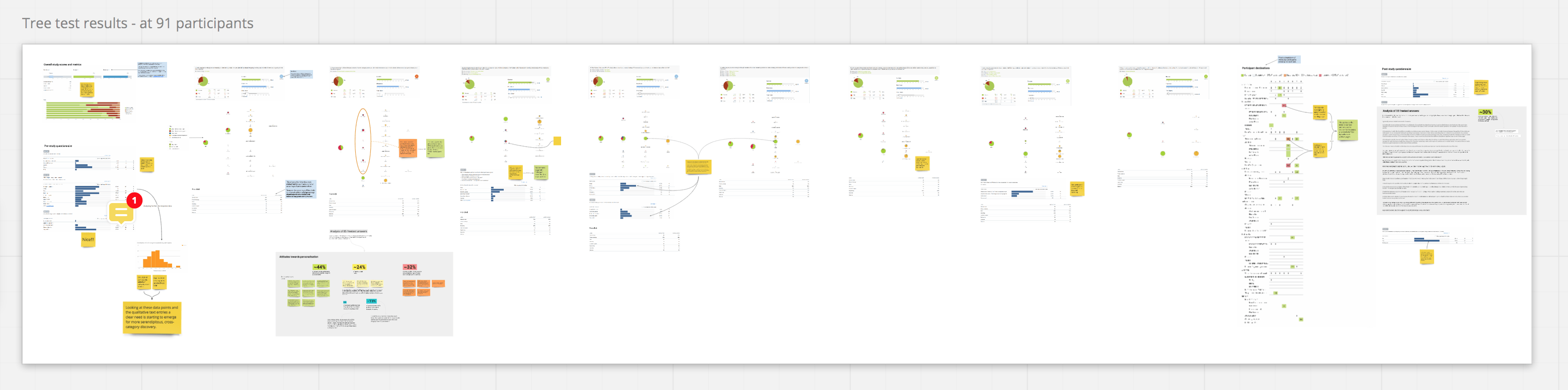 Data visualization of blog user research
So we set about reorganizing our content into categories that speak more clearly to your interests and where you expect to find content.
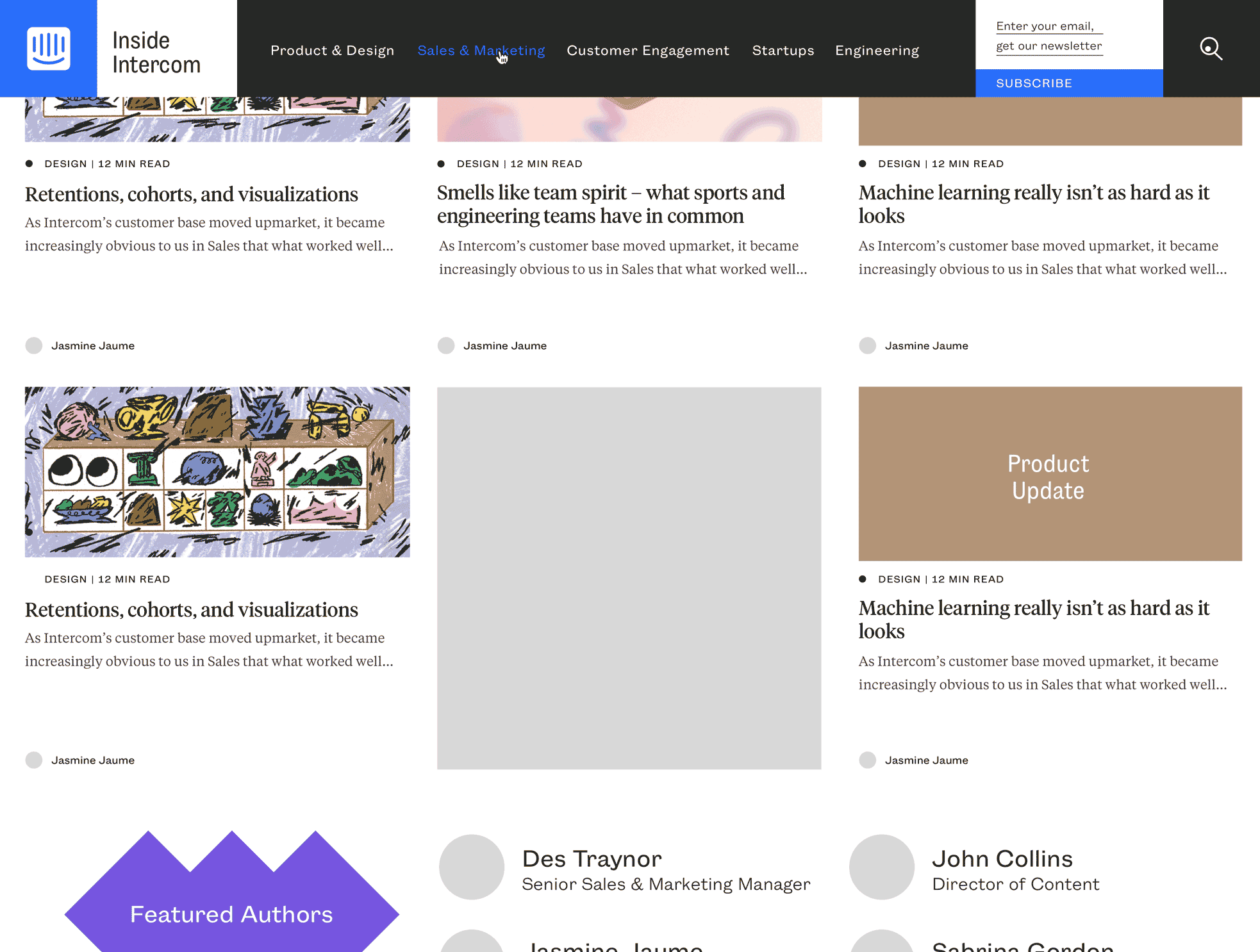
News & Updates is where you can find everything that’s going on with Intercom – both the company and our products. We didn’t want this to be a sterile corporate place where we just talk about ourselves. Instead we want it to be the place where you can learn how to get the most out of our products, whether that’s finding out what features we’ve shipped recently to help you increase visitor conversions and grow your business or find out about the design decisions that went into our recently released Custom Bot builder. We’ll also be sharing lots of best practices – not just from the Intercom team but stories of how our customers are innovatively using our products.
“We’ll continue our tradition of publishing our thoughts on how you can do those jobs better”
More closely matching the teams that typically make most use of Intercom, we now have dedicated sections for Sales, Marketing and Support. We’ll continue our tradition of publishing our thoughts on how you can do those jobs better regardless of what products you use.
We also have dedicated areas for Engineering and Product & Design. We don’t sell products to practitioners in these areas, but those disciplines are part of our DNA, and we’ve always believed in publishing pieces that are not strictly “content marketing”.
And finally we’ve included a dedicated new Growth category where we’ll cover the broad sweep of topics that are relevant as you grow a business from startup to scale-up. Expect topics to range from customer acquisition to hiring a team.
Growing variety of content
From a navigation perspective we wanted to ensure the categories are accessible on the page at all times. Color comes into play here again: it really reinforces the different categories and specific audiences that we speak to now, and exposes that we have something interesting for everyone to read.
We also introduced a deeper, richer homepage for each section, with a content description of what you can expect to read, readily available latest posts (for some good ol’ chronological content), and a featured authors section (we’re proud that so many people throughout the company have written for the blog and contributed to our knowledge sharing).
“Color comes into play here: it really reinforces the different categories”
As Intercom grows up, so does our need for different types of posts. We’re well known for writing thoughtful and meaningful pieces on a wide array of topics, accompanied by beautiful editorial illustration. But sometimes we have a great Twitter thread, video, Instagram post, or spark-of-genius piece that we want to share without waiting for a commissioned illustration. All of that kind of content is now accounted for, and works within a typographic framework that feels cohesive and straightforward, but still playful and opinionated (thanks to Patron and Tiempos).
 Typographical studies
Another goal of this new design was to enrich the reader’s experience without overwhelming you with all the content we publish. Previously, all our “off-blog” editorial projects such as The History of Messaging or The Next Chapter lived sporadically throughout the internet and in our social media channels.
Now they have a home in the side nav of the publication, where we can choose which projects to feature and help our readers explore literally everything Intercom as a whole has to offer. We also have the ability to curate custom content groupings – that might relate to a product launch or announcement, or it could just be our latest thinking on a topic like chatbots.
 Homepage design explorations
 Evolution of the navigation
All in all, this new platform is incredibly flexible and allows us a lot of room to grow into it. We’re really excited to launch it today and watch it grow (and probably break it in some places!) and continue to make Inside Intercom be the best it can be for our readers.
The blog is dead. Long live Inside Intercom.